Themes
Overview
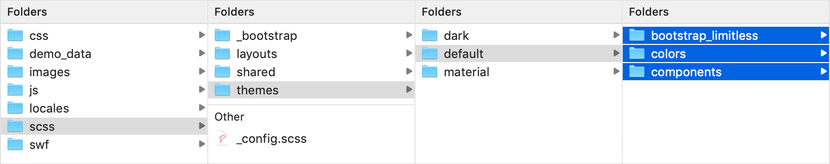
Limitless template provides a very flexible theming support through a set of SCSS files and variables. Currently it has 3 themes: default, material and dark. Each theme has its own set of SCSS files, but only those that are theme specific - features that look the same in all layouts and themes are stored in /shared/ folder. Theme folder contains 3 children folders:
/bootstrap_limitless/- includes all Bootstrap overrides/colors/- color system. All colors are the same in all themes, but kept separate if you want to use different palette/components/- all 3rd party components, extensions and libraries
Screenshot - components
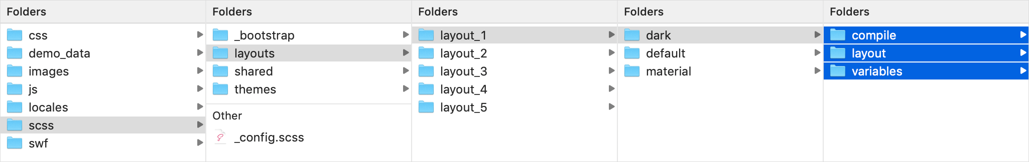
Each layout also has separate set of theme specific files located in /scss/layouts/[layout]/ folder:
/compile/- contains main SCSS files for compilation/layout/- base layout styling/variables/- set of variables. If you want to change default styling, try changing variables first as most of the styles can be changed there without touching of core SCSS files
Screenshot - layout
Description
Well, actually there's no default theme in the template, because all of them can be used separately and don't depend on each other. This is a perfect solution for easy maintaining - if you need to add a new theme, you just need to create a new folder in 2 places with a set of SCSS files and change variables. That's all.
All themes have similar logic - set of SCSS files in 2 locations and, which is the most important part, SCSS variables. They affect everything - look and feel, spacing, backgrounds, main typography etc etc. All components have own set of variables clearly titles in _variables-core.scss and _variables-custom.scss files.
There are some differencies though - some files are theme specific (e.g. ripple effect). 99% of those are reflected in components.scss file, bear that in mind.
List of available themes:
- Default - default here means that it is the first and main theme created for Limitless
- Material - inspired by Google Material Design guidelines, technics and design language
- Dark - planned for next releases. Along with a few more.
Switching between themes
Since components and core features are identical in all themes, you can easily switch between themes - you just need to replace CSS files in your current theme with those from a theme you want to use. Also, depending on component or feature, you can also review JS files with example configurations located in global_assets/js/demo_pages/ folder - some pages contains a bit different configurations or colors to match theme specifications: file uploaders, selects classes, colors etc. Nothing too important.
Screenshot - replace CSS files