SCSS overview
Overview
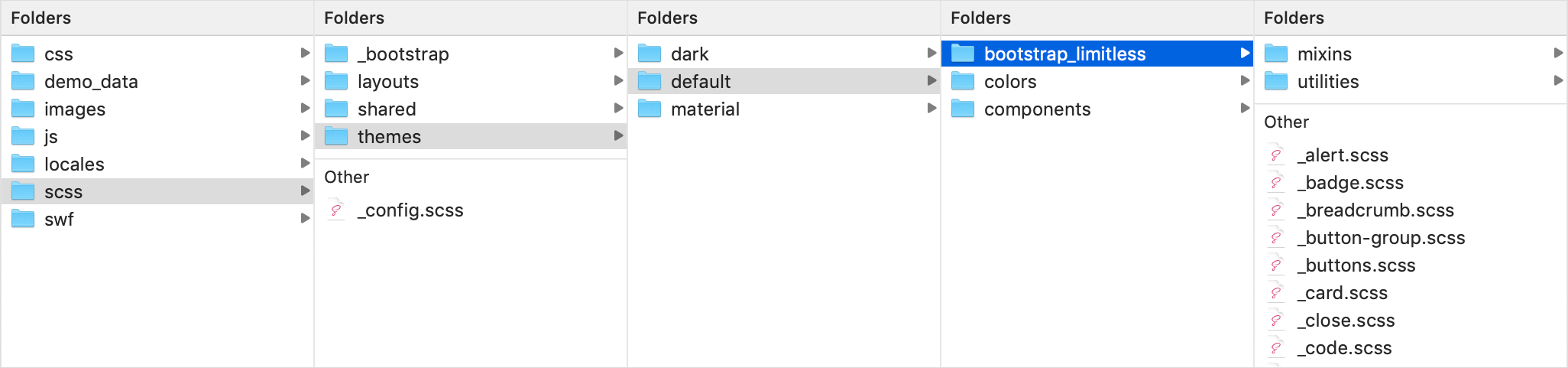
All Limitless styles are based on SCSS pre-processor - it extends the CSS language, adding features that allow variables, mixins, functions and many other techniques that allow you to make CSS that is more maintainable, themable and extendable. In total there are 203 fully commented SCSS files. Among them - Bootstrap components core, Bootstrap core overrides, layout and components related files. All files are properly divided into categories and placed inside nested folders:
Screenshot - scss structure

Editing
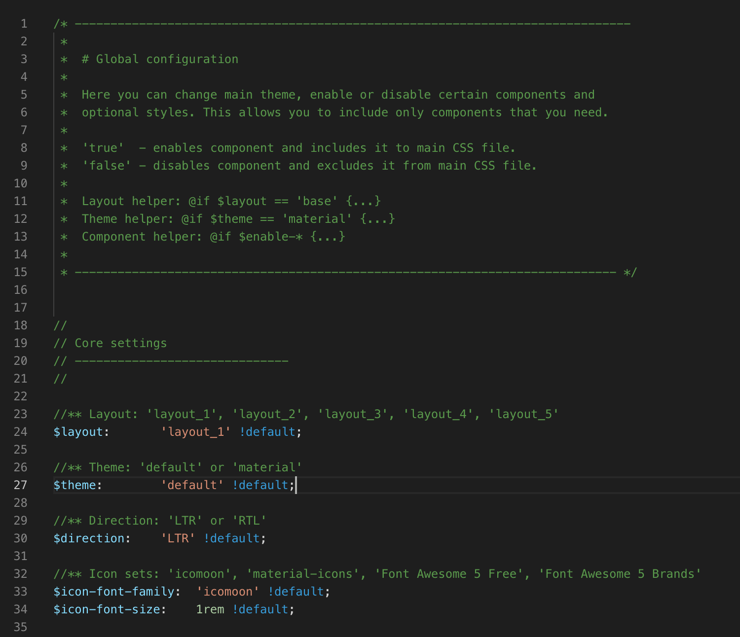
To edit SCSS files, use any code editor that supports .scss file extensions. I prefer to use Sublime Text editor with additional SASS/SCSS syntax highlight package, it's very flexible and works really fast. To include or exclude components from your project, edit main configuration file _config.scss located in global_assets/scss/ folder. This file is also responsible for layout specific configs - layout type, theme and direction. make sure you have correct values.
Screenshot - main files to edit
When a new Bootstrap version comes out, it's very important to keep upgrading process as simple as possible. That is why all core Bootstrap files remain untouched, all necessary changes need to be done in separate file with the same name in global_assets/scss/themes/[theme]/bootstrap_limitless/ folder. This allows us to override default bootstrap CSS file after compiling.
I strongly recommend not to make any changes in default Bootstrap SCSS files, but use files from global_assets/scss/themes/[theme]/bootstrap_limitless/ folder instead. All these files will be overridden in every future update. This will simplify your upgrading process in the future. But, of course, feel free to update any of template files if necessary.
Screenshot - Bootstrap overrides
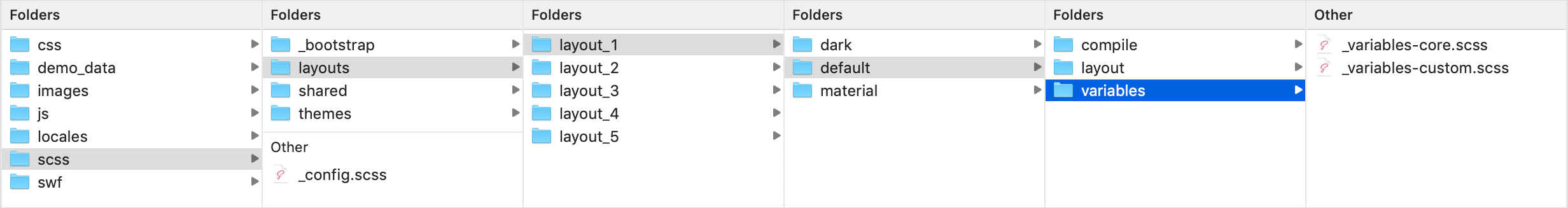
If you need to change a default theme, you can edit template's variables - all main colors, spacings and other styles are located there. Main template's variables are stored in 2 files: _variables-core.scss and _variables-custom.scss, located in global_assets/scss/[layout]/[theme]/variables/ folder.
_variables-core.scsscontains default Bootstrap variables overrides only_variables-custom.scsscontains all other variables used in the template.
Screenshot - variables
Compiling
There are tons of different applications and extensions available for SCSS compiling, but not all of them support all build tools used in Limitless. Previous versions supported desktop apps like Koala or Crunch, starting from version 2.0 onwards desktop applications are not officially supported, so use them at your own risk.
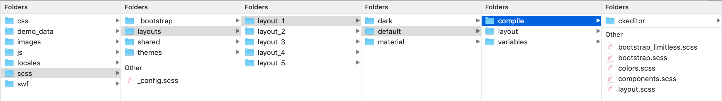
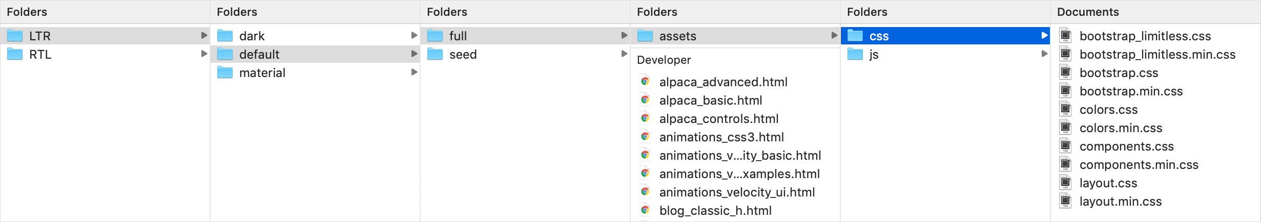
By default, Limitless template uses 5 separate compiled CSS files - bootstrap.css, bootstrap_limitless.css, colors.css and components.css and layout.css. CSS files have same names as 5 main SCSS files located in global_assets/scss/layouts/[layout]/[theme]/compile/ folder. In fact, these 5 css files are automatically generated from main SCSS files. So to compile CSS files, use only these 5 main scss files:
bootstrap.scss- Bootstrap corebootstrap_limitless.scss- Bootstrap core overridescomponents.scss- all template components and plugins, except Bootstrap oneslayout.scss- layout basecolors.scss- color system (optional)
First 4 files are required for proper styling. Do not edit any of these files if you don't need to add something new to them, instead use _config.scss file to include/exclude existing styles from components.css. Color system is completely optional, if you've setup your primary theme, you can exclude this file and re-compile your CSS.
Keep in mind that /compile/ folder is sensitive to files - gulp file is configured to dynamically compile all files from this folder into separate CSS files.
Screenshot - 5 main files
SCSS files
SCSS folder includes all files responsible for template styling - core, layout, components, plugins, page kits etc. All files are properly structured according to the category: _bootstrap - Bootstrap framework core styling; layouts - all layout-specific styles;shared - styles that are used across all layouts; themes - theme-specific set of files, includes bootstrap-limitless - Limitless overrides of Bootstrap core styling loaded on top of original ones and components - main template components, custom pages and plugins.
5 main files that import all other files are in separate folder - bootstrap.scss, colors.scss, components.scss and bootstrap_limitless.scss and layout.scss. If you need to include or exclude any of existing files, make changes in _config.scss file. But if you need to add a new one, feel free to edit them. Below is the table with categorized SCSS files used in the template:
Bootstrap core
Contains 53 main files and 30 mixins. File bootstrap.scss exists in 2 locations - in /bootstrap/ and in .../compile/ folders. Editing any of those 2 files are not recommended since it's a core functionality and it might affect other components.
| File name | Description | |
|---|---|---|
| Main files | ||
_alert.scss |
Alert components | |
_badge.scss |
Badges component | |
_breadcrumbs.scss |
Breadcrumbs component | |
_button-group.scss |
Button groups | |
_buttons.scss |
Button stylings | |
_card.scss |
Cards component | |
_carousel.scss |
Carousel component | |
_close.scss |
Close button | |
_code.scss |
Inline and blocks of code | |
_custom-forms.scss |
Custom CSS form components | |
_dropdowns.scss |
Dropdown menus | |
_forms.scss |
Basic form components styling | |
_functions.scss |
Main SASS functions used in Bootstrap | |
_grid.scss |
Responsive mobile-first grid | |
_images.scss |
Image styling | |
_input-groups.scss |
Input groups component | |
_jumbotron.scss |
Jumbotron component | |
_list-group.scss |
List group nav component | |
_media.scss |
Media lists | |
_mixins.scss |
Mixins loading file | |
_modals.scss |
Modal dialogs | |
_nav.scss |
Tab, pill and other navs | |
_navbar.scss |
Navbar | |
_pagination.scss |
Pagination component | |
_popover.scss |
Popovers component | |
_print.scss |
Print styles | |
_progress.scss |
Progress bars component | |
_reboot.scss |
Reset default CSS | |
_root.scss |
Root level styles | |
_tables.scss |
Tables styling | |
_tooltip.scss |
Tooltip component | |
_transitions.scss |
Default transitions | |
_type.scss |
Typography, page header and contextual backgrounds | |
_utilities.scss |
Utilities | |
_variables.scss |
Main variables | |
bootstrap-grid.scss |
Import files for grid | |
bootstrap-reboot.scss |
Import other files for proper reboot | |
bootstrap.scss |
Import all files | |
| Bootstrap mixins | ||
_alert.scss |
Alerts with color options | |
_background-variant.scss |
Contextual backgrounds | |
_badge.scss |
Badge colors | |
_border-radius.scss |
Border radius: top, bottom, left, right | |
_box-shadow.scss |
Box shadow config | |
_breakpoints.scss |
Breakpoints configuration | |
_buttons.scss |
Buttons with color and sizing options | |
_caret.scss |
Caret directions | |
_clearfix.scss |
Clear and reset floating | |
_float.scss |
Left and right floating, including reset | |
_forms.scss |
Form control validation | |
_gradients.scss |
Gradient options | |
_grid-framework.scss |
Responsive grid system | |
_grid.scss |
Grid columns, container and offsets | |
_hover.scss |
Hover and focus mixins | |
_image.scss |
Responsive and retina images | |
_list-group.scss |
List group color variants | |
_lists.scss |
List styles | |
_nav-divider.scss |
Navigation divider | |
_pagination.scss |
Pagination sizes | |
_reset-text.scss |
Text reset | |
_resize.scss |
Resize elements | |
_screen-reader.scss |
Screen reader mixins | |
_size.scss |
Sizing shortcuts | |
_table-row.scss |
Table row styling variants | |
_text-emphasis.scss |
Text colors | |
_text-hide.scss |
Text show/hide | |
_text-truncate.scss |
Long text truncate | |
_transition.scss |
Core transitions | |
_visibility.scss |
Visibility mixins | |
| Bootstrap utilities | ||
_align.scss |
Vertical alignment | |
_background.scss |
Contextual backgrounds | |
_borders.scss |
Border width, style and radius | |
_clearfix.scss |
Clearing floats | |
_display.scss |
Responsive display utilities | |
_embed.scss |
Responsive embeds | |
_flex.scss |
Flexbox utility classes | |
_float.scss |
Responsive floating | |
_position.scss |
Position classes | |
_screenreaders.scss |
SR utility classes | |
_shadows.scss |
Predefined box shadows | |
_sizing.scss |
Width and height classes | |
_spacing.scss |
Responsive spacing classes | |
_text.scss |
Text style classes | |
_visibility.scss |
Visible/invisible classes | |
Template overrides
Contains 26 modified .scss files from global_assets/scss/_bootstrap/ folder. Most of the files include extended components functionality, options and styles. If you want to make any changes in these files, feel free to do so. If you don't use any of these components, exclude them in _config.scss file.
| File name | Description | |
|---|---|---|
| Main files | ||
_alert.scss |
Alert components | |
_badge.scss |
Badges component | |
_breadcrumbs.scss |
Breadcrumbs component | |
_button-group.scss |
Button groups | |
_buttons.scss |
Button stylings | |
_card.scss |
Cards component | |
_close.scss |
Close button | |
_code.scss |
Inline and blocks of code | |
_custom-forms.scss |
Custom CSS form components | |
_dropdowns.scss |
Dropdown menus | |
_forms.scss |
Basic form components styling | |
_input-groups.scss |
Input groups component | |
_list-group.scss |
List group nav component | |
_media.scss |
Media lists | |
_mixins.scss |
Mixins loading file | |
_modals.scss |
Modal dialogs | |
_nav.scss |
Tab, pill and other navs | |
_navbar.scss |
Navbar | |
_pagination.scss |
Pagination component | |
_popover.scss |
Popovers component | |
_progress.scss |
Progress bars component | |
_reboot.scss |
Reset default CSS | |
_tables.scss |
Tables styling | |
_tooltip.scss |
Tooltip component | |
_type.scss |
Typography, page header and contextual backgrounds | |
_utilities.scss |
Utilities | |
Components
Contains 94 .scss files. All these files are responsible for 3rd party libraries styling and functionality: plugins, extensions, custom page kits, charts etc. Feel free to edit any of these files. It also includes demo styles that are included by default for demonstration purposes only. I would suggest you to remove _demo.scss file in production.
| File name | Description | |
|---|---|---|
| Charts | ||
charts.scss |
Charts base | |
c3.scss |
C3.js visualization library | |
d3.scss |
D3.js visualization library | |
sparklines.scss |
Sparklines library | |
| jQuery UI | ||
interactions.scss |
Interactions and other elements | |
widgets.scss |
Widgets library | |
| Maps | ||
google-maps.scss |
Google maps | |
jvectormap.scss |
Vector maps | |
| Pace loader | ||
theme-default.scss |
Default thin line | |
pace-demo.scss |
Pace demonstration | |
theme-bar-lg.scss |
Large progress bar theme | |
theme-bar-sm.scss |
Small progress bar theme | |
theme-bar.scss |
Default progress bar theme | |
theme-corners.scss |
Corners theme | |
theme-perspective.scss |
Perspective theme | |
theme-radar.scss |
Radar theme | |
theme-squares.scss |
Rotating squares theme | |
theme-tail-circle.scss |
Tail and background circle theme | |
theme-tail.scss |
Tail theme | |
theme-xbox-lg.scss |
Large Xbox theme | |
theme-xbox-sm.scss |
Small Xbox theme | |
theme-xbox.scss |
Default Xbox theme | |
| Page kits | ||
chats.scss |
Chat layouts and options | |
blog.scss |
Blog pages | |
ecommerce.scss |
Set of ecommerce pages | |
error.scss |
Error pages | |
inbox.scss |
Mail system templates | |
login.scss |
Login and registration pages | |
profile.scss |
User profiles | |
task-manager.scss |
Task manager grid and detailed view | |
timelines.scss |
Timeline directions and styles | |
| Plugins | ||
_bootstrap-switch.scss |
Bootstrap toggle switches | |
_switchery.scss |
Switchery toggles | |
_uniform.scss |
Custom checkboxes, radios and file input styling | |
_ace.scss |
Ace code editor | |
_summernote.scss |
Summernote text editor | |
_trumbowyg.scss |
Trumbowyg text editor | |
_typeahead.scss |
Typeahead extension | |
_alpaca.scss |
JSON forms | |
_validation.scss |
Form validation | |
_passy.scss |
Password checker and generator | |
_floating-labels.scss |
Floating labels component | |
_dual-listbox.scss |
Dual multiple select boxes | |
_touchspin.scss |
Touchspin spinners for Bootstrap | |
_wizard.scss |
Form wizard | |
_select2.scss |
Single and multiple Select2 selects | |
_multiselect.scss |
Bootstrap multiselect | |
_tokenfield.scss |
Tokenfield for Bootstrap | |
_tags-input.scss |
Tags input plugin | |
_fancybox.scss |
Lightbox plugin | |
_image-cropper.scss |
Image cropper extension | |
_fab.scss |
Floating action buttons | |
_progress-buttons.scss |
Ladda - buttons with spinner and progress bar | |
_dragula.scss |
Drang and drop library | |
_perfect-scrollbar.scss |
Custom scrollbar | |
_ripple.scss |
Wave click effect for material layout | |
_slinky.scss |
Multilevel horizontal mega menu navigation | |
_sticky.scss |
Sticky kit | |
_fullcalendar.scss |
Fullcalendar - event calendar extension | |
_fancytree.scss |
Fancytree - dynamic multi level tree view | |
_prism.scss |
Prism - syntax highlighter | |
_headroom.scss |
Headroom - hideable navbars | |
_sweet-alerts.scss |
Nice looking alerts and dialogs | |
_jgrowl.scss |
jGrowl - growl-like notifications | |
_noty.scss |
Noty - yet another notification library | |
_pnotify.scss |
PNotify - powerful notification library | |
_noui-slider.scss |
NoUI slider library | |
_ion-range-slider.scss |
ION range slider library | |
_slider-pips.scss |
Pips and tooltip for jQuery UI sliders | |
_anytime.scss |
Anytime - date and time picker | |
_daterange.scss |
Date range picker | |
_spectrum.scss |
Spectrum - color picker | |
_pickadate/base.scss |
Pick-a-date - basic styling | |
_pickadate/date.scss |
Pick-a-date - date picker | |
_pickadate/time.scss |
Pick-a-date - time picker | |
_dropzone.scss |
Dropzone - HTML5 single and multiple file uploader | |
_file-input.scss |
Bootstrap file input - single and multiple file uploader | |
_plupload.scss |
Plupload - file uploader with multiple runtimes | |
_datatable-autofill.scss |
Datatable extension - autofill | |
_datatable-buttons.scss |
Datatable extension - buttons | |
_datatable-columns-reorder.scss |
Datatable extension - columns reorder | |
_datatable-fixed-columns.scss |
Datatable extension - fixed columns | |
_datatable-fixed-header.scss |
Datatable extension - fixed header | |
_datatable-keytable.scss |
Datatable extension - keytable | |
_datatable-responsive.scss |
Datatable extension - responsive table | |
_datatable-rows-reorder.scss |
Datatable extension - rows reorder | |
_datatable-scroller.scss |
Datatable extension - scroller | |
_datatable-select.scss |
Datatable extension - select | |
_datatables.scss |
Datatables base | |
_footable.scss |
Footable - responsive static tables | |
_header-elements.scss |
Page and card header components | |
_demo.scss |
Styles used in live preview | |
_fouc.scss |
Flashing of unstyled content fix | |
_helpers.scss |
Helper classes | |
_helpers.scss |
Helper classes | |
| Core | ||
_variables-core.scss |
Bootstrap variables overrides | |
_variables-custom.scss |
Additional variables | |
_ll_functions.scss |
Custom template functions | |
_ll_mixins.scss |
Custom template mixins | |
_palette.scss |
Color palette | |
_colors.scss |
Color classes | |
_content.scss |
Template content's base | |
_header.scss |
Page header | |
_boxed.scss |
Boxed layout | |
_sidebar.scss |
Sidebars with navigation | |
| Main files for compile | ||
_bootstrap.scss |
Main bootstrap SCSS file, moved from _/_bootstrap/ folder |
|
_bootstrap-limitless.scss |
Bootstrap overrides | |
_layout.scss |
Layout base | |
_colors.scss |
Color system | |
_components.scss |
Template components | |
CSS files
Files overview
Limitless template includes 4 mandatory and 1 optional compiled CSS files, which are included in all pages. All files are properly commented so that you can quickly navigate through sections. All comments that can be found in SCSS files are removed during compilation to reduce the size of CSS files. Limitless layouts include both compressed and uncompressed CSS files.
bootstrap.css,*.min.css- Bootstrap core, always use minifiedbootstrap_limitless.css,*.min.css- Bootstrap core overrideslayout.css,*.min.css- layout basecomponents.css,*.min.css- all template components and pluginscolors.css,*.min.css- color classes, always use minified
Note: both minified and unminified CSS files are inside same folder, because paths to images and font files are similar in both versions. If you want to place source or minified files into different folders, don't forget to change those paths. Also feel free to remove unnecessary CSS files if you don't use them. I strongly suggest not to make changes directly in CSS, but do it in SCSS files instead to avoid problems with upgrading to newer versions. If you need any help with compiling CSS, raise a support request.
Screenshot
CSS editing
Since main styling source is SCSS files kit, I strongly recommend to use minified versions of all CSS files included to the package and not to change CSS files directly. Edit SCSS files instead, this will help you to keep all your changes in future updates, because changes are getting added to SCSS files first, then SCSS files need to be re-compiled and detailed instructions about what needs to be changed and where it should be done in SCSS files only are provided. CSS files are generated dynamically from SCSS files.
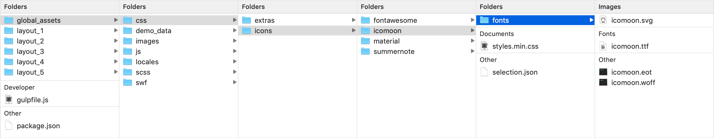
Icon fonts
Although editing of main files is not recommended, icon font files can be edited. I didn't convert them to SCSS files as there is no need actually, because there are quite few CSS properties for them - general font reset and icon codes. If you need to add any changes to the icon styles.css files, feel free to do so. Icon sets are rarely get an update, but if you need to edit Icomoon set, raise a request for selection.json file.
Screenshot